


![]() Press release
Press release
33KB
Comunicato Stampa disponibile solo in lingua originale.
Press release available only in original language.
Stuttgart, Germany – Vibrant, diverse, dynamic: with its new brand identity, #bosch is underlining the company’s digital transformation to a provider of solutions for connected living. “With connected solutions, we want to help improve quality of life and conserve resources. Our new brand identity follows this example. Its design reflects the diversity and individuality of life and our products,” says Dr. Volkmar Denner, chairman of the board of management of Robert Bosch GmbH, explaining the background of the new brand identity. The new #corporate design pushes the emotional aspects of the brand to the fore with more colors and a new language of imagery and form. The red #bosch lettering, the claim “Invented for life,” and the armature in a circle will remain unchanged. “Our company has changed greatly in recent years. The new #corporate design gives expression to digital transformation at our company,” Denner adds. The smart home provides more convenience in the home, and the car gets help on its own if there is an accident.
New #corporate design makes “Invented for life” tangible
The new #corporate design is geared toward the special design requirements of digital media. However, it is also used in printed media, product packaging, and interior design. The simple design system has only very few rigid rules, which gives users creative freedom when putting the #corporate design into practice. The new visual worlds show the benefits of “Invented for life” in warm colors. The focus is on the users of technology. “Whenever people come into contact with the brand, we want to make our claim, ‘Invented for life,’ tangible. We do this through images and graphic elements,” says Peter Feldmann, head of brand management and marketing communication at #bosch.
One new graphic element is what is known as the supergraphic. Through straight, overlapping, and curved lines, it symbolizes the #bosch brand promises: quality, global partnership, fascinating products, and responsibility. The supergraphic features the new range of colors. This is based on the colors used within the #bosch group to date: red, blue, light blue, and #green. This range has been expanded to include mixed shades of the primary colors, such as fuchsia. A further design element is colored text boxes that can overlap. The overlapping fields stand for the link between people and technology. Summing up the new design, Gregor Schilling, head of #corporate design at #bosch, says: “Together, full-screen background images, the supergraphic, and overlapping text boxes result in a lively, distinctive design.”
#bosch will introduce the new #corporate design gradually over the next two years.

1-RB-22033
![]() 2126x1535, 488KB
2126x1535, 488KB
1-RB-22034
![]() 3625x1535, 1MB
3625x1535, 1MB
1-RB-22035
![]() 2126x1535, 489KB
2126x1535, 489KB
1-RB-22057
![]() 1535x2126, 552KB
1535x2126, 552KB
1-RB-22058
![]() 2126x1535, 662KB
2126x1535, 662KB
1-RB-22059
![]() 2126x1535, 782KB
2126x1535, 782KB
![]() Press release
Press release
33KB
News correlate |
||
|
|
|
aprile 18, 2024
|
aprile 17, 2024
|
aprile 17, 2024
|
|
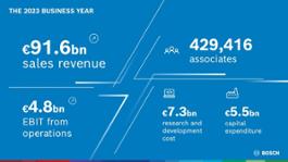
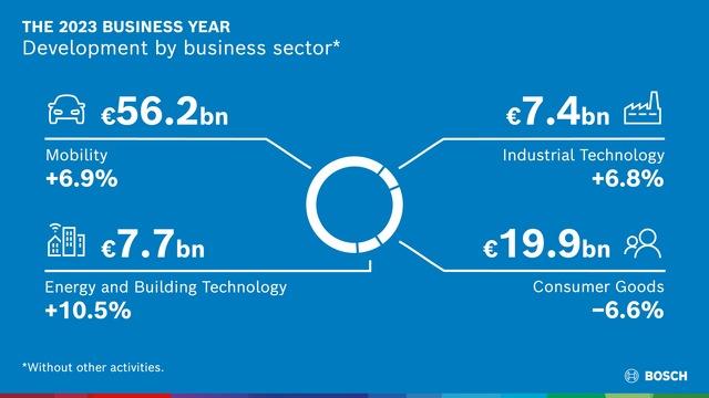
Esercizio 2023: fatturato salito a 91,6 miliardi di euro / EBIT aumentato al 5,3% su base annuaProspettive contenute per il 2024: ... |
Il continuo impegno di Bosch nella ricerca di soluzioni volte a creare un mondo più sano e sostenibile è più di una missione, rapp... |
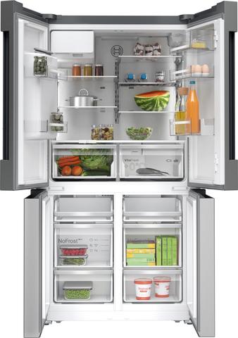
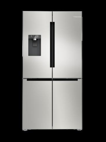
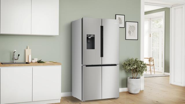
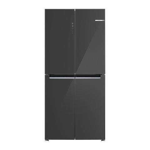
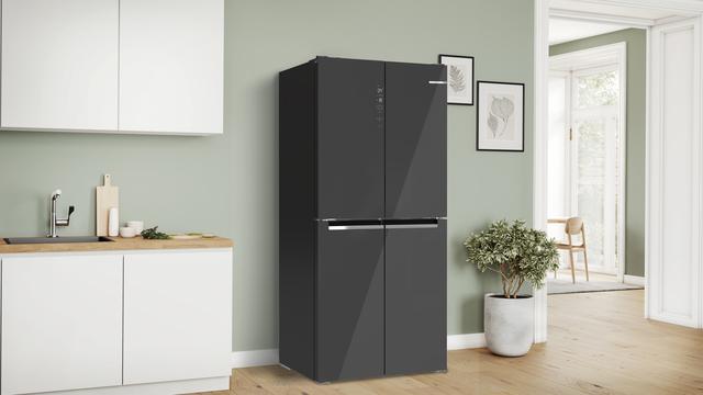
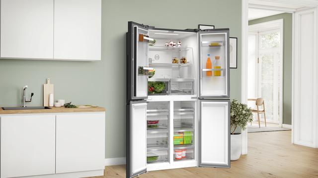
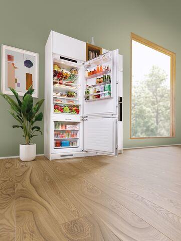
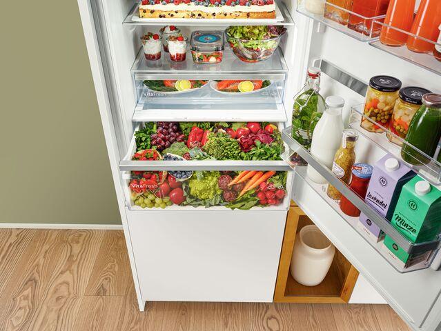
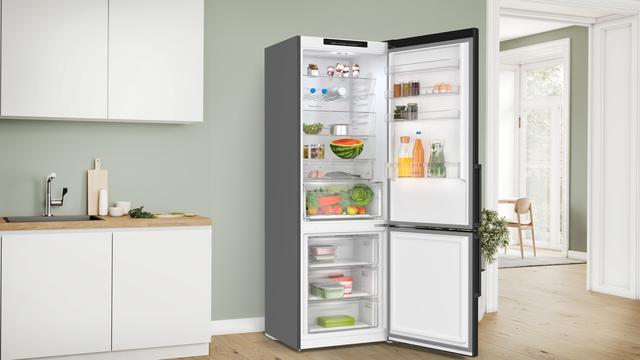
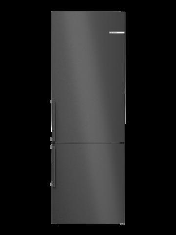
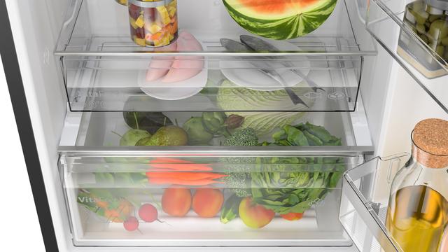
Bosch presenta a EuroCucina 2024 le ultime novità della gamma frigoriferi XXL: i nuovi frigoriferi combinati da incasso da 70 cm e... |
Ti potrebbe interessare anche |
||

|
|
|
aprile 17, 2024
|
aprile 17, 2024
|
aprile 10, 2024
|
|
[ 16-21 Aprile 2024, Rho Fiera Milano, Pad. 4, Stand C05 ]“Live Responsibly #LikeABosch” è il messaggio che Bosch rilancia in occa... |
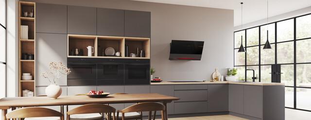
Nelle case moderne la cucina è sempre più spesso integrata alla zona living e questo porta a considerare attentamente la configura... |
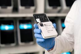
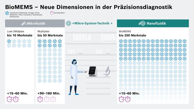
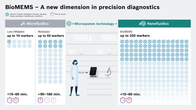
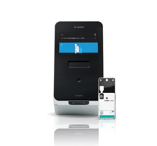
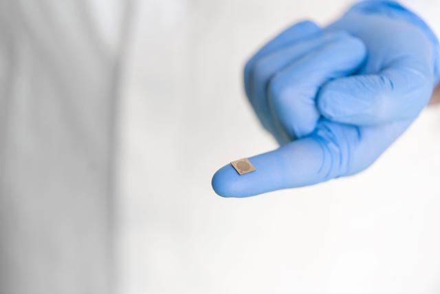
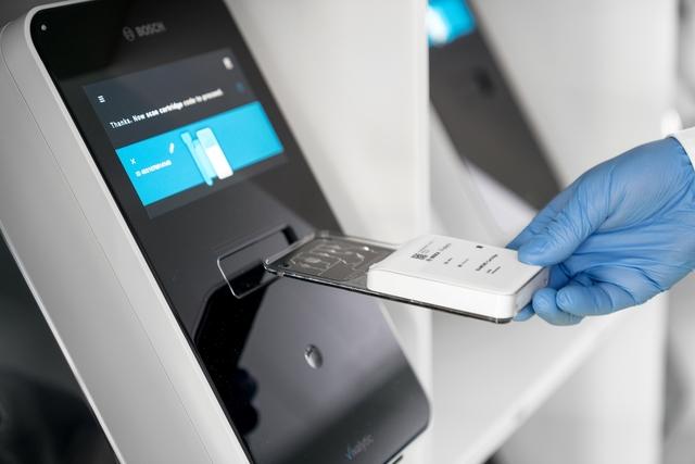
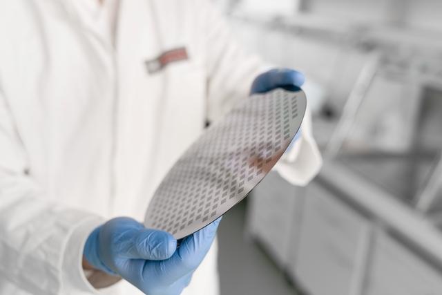
Nuova partnership per la piattaforma di analisi Vivalytic: Bosch e Randox Laboratories Ltd. investiranno 150 milioni di euro in ri... |
© Copyright 2024


 Inglese
  Condividi
 Condividi via mail
  Automotive
 Sport
Sport Events
 Art&Culture
 Design
 Fashion&Beauty
 Food&Hospitality
 Tecnologia
 Nautica
 Racing
 Excellence
 Corporate
 OffBeat
 Green
Green Gift
Gift Pop
Pop Heritage
 Entertainment
 Health & Wellness