
maggio 11, 2016 - European Space Agency
From petabytes to pictures
Comunicato Stampa disponibile solo in lingua originale.
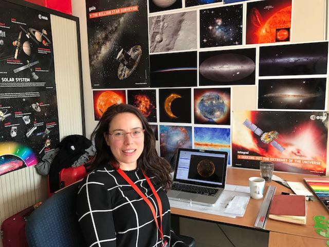
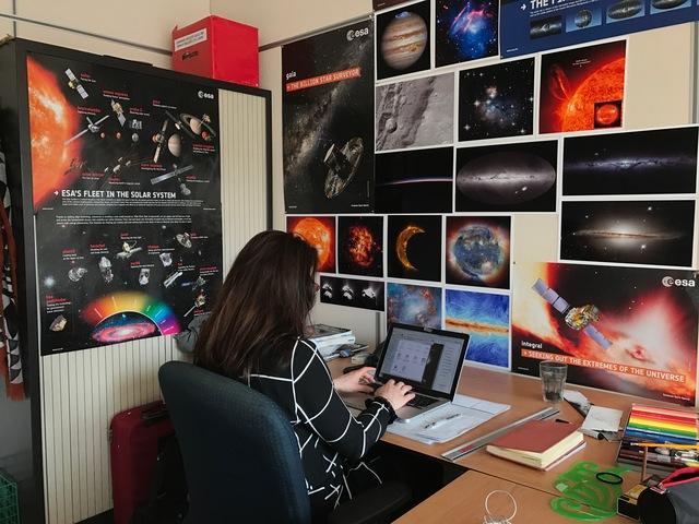
Thousands of scientists are at the Living Planet Symposium in Prague this week to present the latest findings on our changing planet. Between the mountains of data coming from multiple satellites and the high level of expertise needed to translate them into useful information, the results are not always easy to understand.
Data visualisation and graphics help to explain these complex issues and communicate results to the general public. This is especially important when the data inform matters of wide concern to society, such as climate change or ozone depletion. Society’s decision-makers need this step to make the right choices to keep us and our planet safe.
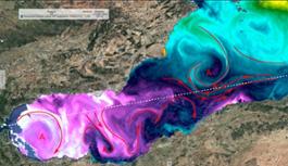
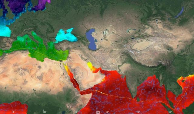
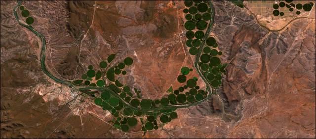
Colour palettes that are intuitively understood are often used when communicating with a non- specialist audience. For example ‘cold’ blue to ‘hot’ red are used to represent sea-surface temperature.
Visualisation techniques are also used to show how a satellite collects data or illustrate how data are processed.A prime example is the animation above. The CryoSat satellite uses a radar altimeter to measure the thickness of sea ice and ice sheets. It has been beaming down readings for over five years, which were then processed to quantify changes in ice. These numbers were used to create the animation we see above, which clearly illustrates the decrease in ice volume in the Antarctic and Greenland ice sheets over the past five years.
“Climate science is often in the political and media spotlight, and as a scientist in the field it’s great to know that people are interested in our work,” said Andy Shepherd from the UK’s University of Leeds.
“But satellite observations – even something basic like measurements of ice sheet thinning – can be difficult to explain in a short story. That’s where data visualisation is most powerful, as it really helps get complicated messages across in a clear and concise way.
“It’s surprising how much effort goes in to producing even a short animation, but in my experience they can be worth their weight in gold.”
Data visualisation isn’t only about how you present scientific results, but about choosing which results to show.
“Sometimes, it can be more meaningful to present derived data than the data themselves,” says Philip Eales from the company Planetary Visions.
“For example, by computing the deviation of sea-surface temperature at a point from the average for its latitude, we can highlight warm and cold ocean currents.
“When presenting 30 years of soil moisture, the monthly anomalies were more meaningful than the absolute measures of soil moisture, with extreme dryer and wetter conditions corresponding to periods of drought and flood.”
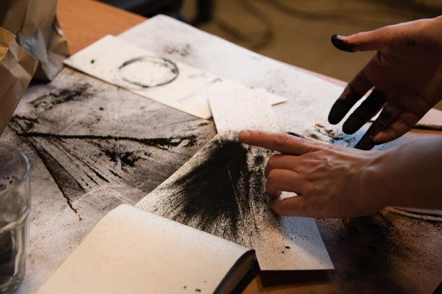
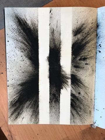
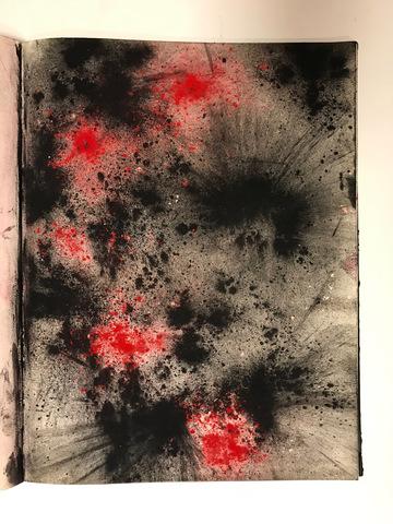
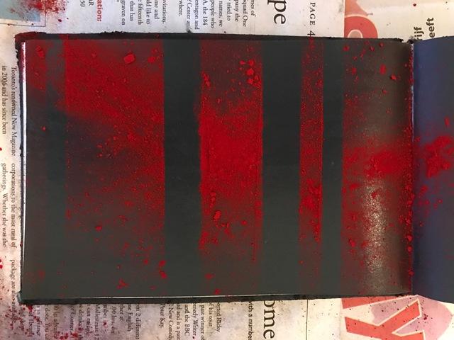
Giuseppe Ruello from the University of Naples, Italy, compared the processing chain of satellite data to pasta: when you want to make pasta, you don’t go to the store and buy grain (raw data) but dried pasta (semi-finished products).The final product, a spaghetti alla carbonara or rigatoni all’amatriciana, then needs to be made in order to consume the pasta.
Data visualisation puts the food right on the table.


Data_as_pasta
![]() 3146x2790, 3MB
3146x2790, 3MB
Ground_displacement_in_Bucharest_Romania

![]() 4183x2849, 4MB
4183x2849, 4MB
News correlate |
||
|
|

|
aprile 13, 2017
|
marzo 24, 2017
|
marzo 24, 2017
|
|
Comunicato Stampa disponibile solo in lingua originale. With around 90% of world trade carried by ships, making sure a vessel foll... |
Comunicato Stampa disponibile solo in lingua originale. With the pair of Sentinel-2 satellites now in orbit, users are looking ahe... |
Comunicato Stampa disponibile solo in lingua originale. From 27 February to 17 March 2017, Aoife van Linden Tol, a multimedia arti... |


Ti potrebbe interessare anche |
||
|
|
|
marzo 23, 2017
|
marzo 16, 2017
|
marzo 06, 2017
|
|
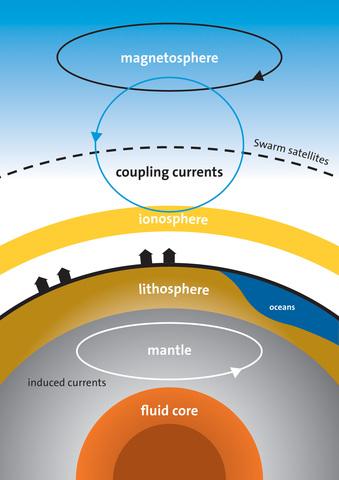
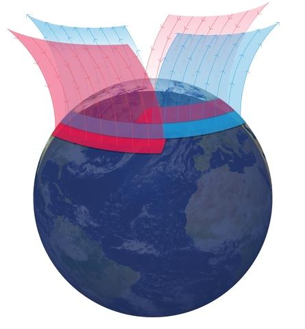
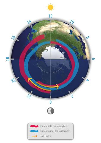
Information from ESA’s magnetic field Swarm mission has led to the discovery of supersonic plasma jets high up in our atmosphere t... |
Quarantadue è la risposta, ma quale è la domanda? Gli scienziati dell'Università di Zurigo hanno voluto sondare come le cellule im... |
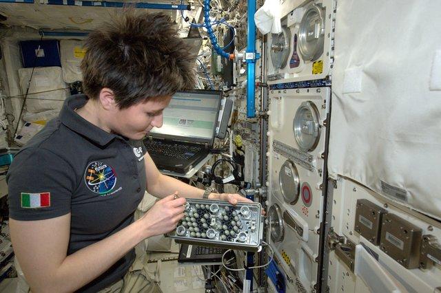
Comunicato Stampa disponibile solo in lingua originale. Vloggers recently spent two days at ESA’s astronaut centre to prepare for ... |
 Inglese
  Condividi
 Condividi via mail
  Automotive
 Sport
Sport Events
 Art&Culture
 Design
 Fashion&Beauty
 Food&Hospitality
 Tecnologia
 Nautica
 Racing
 Excellence
 Corporate
 OffBeat
 Green
Green Gift
Gift Pop
Pop Heritage
 Entertainment
 Health & Wellness